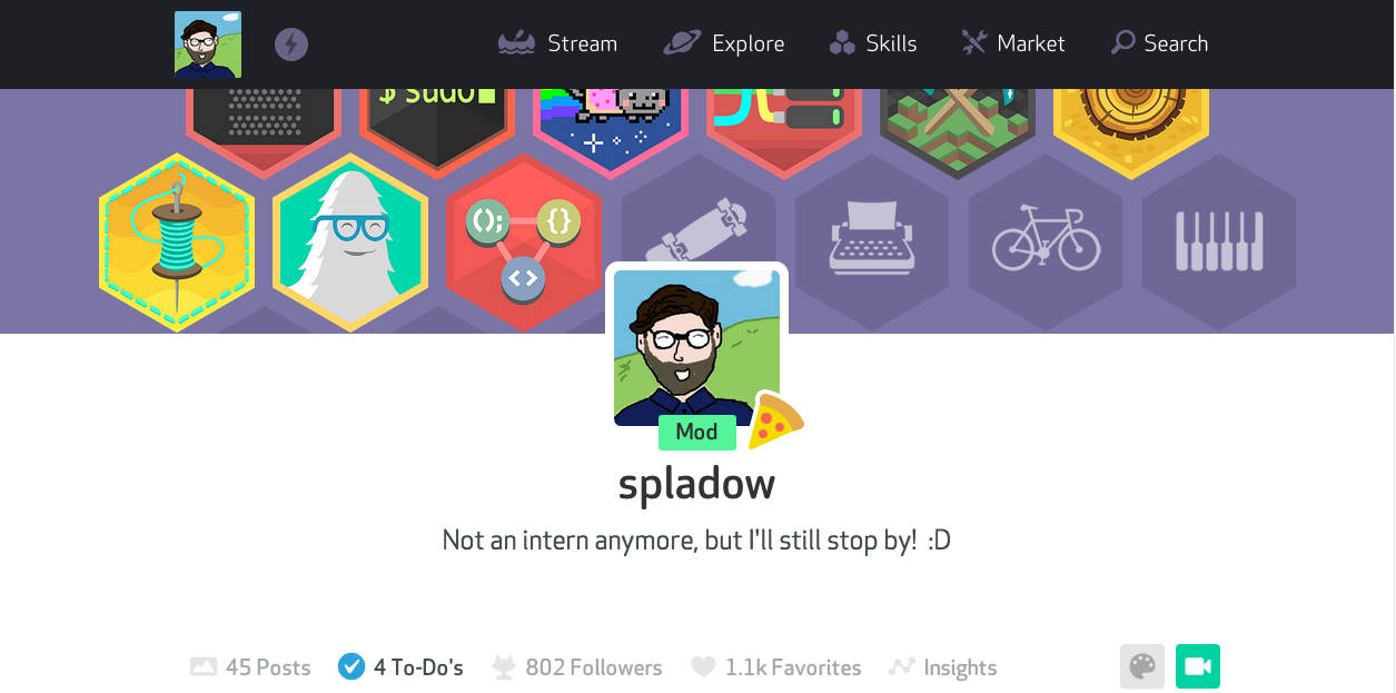
The To-Do List
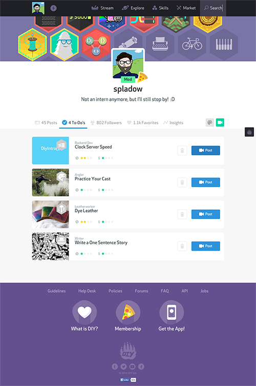
(The to-do list currently in production)
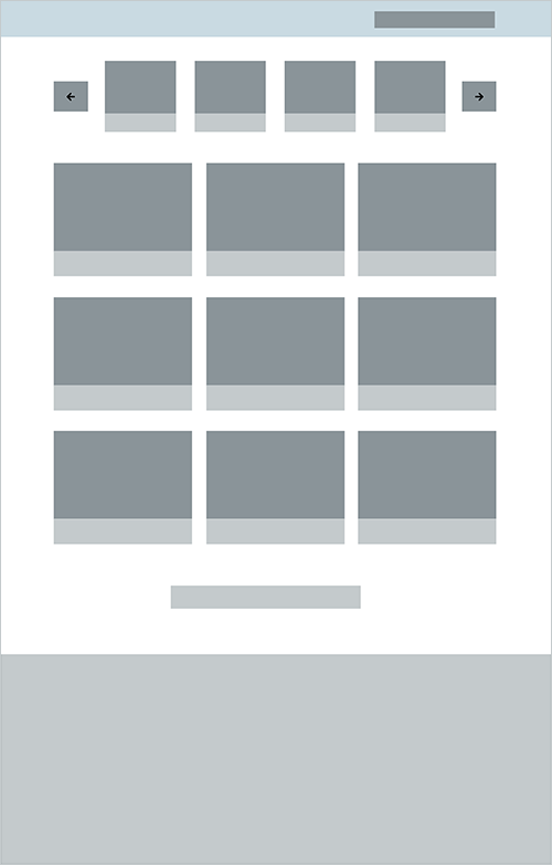
To-Do's began as a way to address the fact that it was becoming harder for our members to navigate the skills page and keep track of the challenges they wanted to tackle as the catalogue of skills grew to well over 100. The team was really excited at the opportunity to re-introduce the forking feature here as well. We thought we could have members mark either challenges or individual projects "To Do". If they picked a user's project, the forked version would be linked to the original through our commenting system and the original poster would get a notification. Ultimately, there were some rough edges on some of the forking flows and we decided to scale back the feature, but structure it in a way that it would be able to accomodate forking in a later release. You can see this reflected in the move toward project images for the challenges and less emphasis on skills and badges.
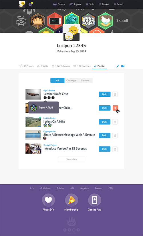
One of the early problems I had with forking was that kids can submit projects to multiple challenges in different skills. It's not uncommon to see someone submit a project that completes three or more challenges and we wouldn't know which project a member intended to complete with thier forked version. I was using a lot of real estate trying to support these mega projects. There were debates about whether we really wanted to support completing multiple challenges with one project at all and the impact that decision had on our moderation process.
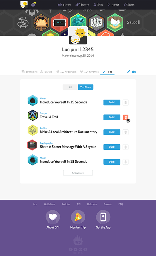
Once we decided to shelf forking and focus on the single use case of planning activities, it became clear that to-do lists could easily take advantage of the metadata we were using to power the activity guides we show parents and educators who had signed up for our Extra Awesome features. We had interviews with parents that showed us one of the things they liked most about the site was that they could point their kids to it when they were bored and they would find something to do. We decided to minimize the friction between logging in and finding a project by showing time and cost estimates. Kids could go to their to-do lists with no real plan and find a project they could hop into easily, as well as see the more ambitious projects they'd marked as interesting so they could start getting the materials together for next time.
The final visual polish was done by DIY's resident Mycologist Ryan Brock :D
Search
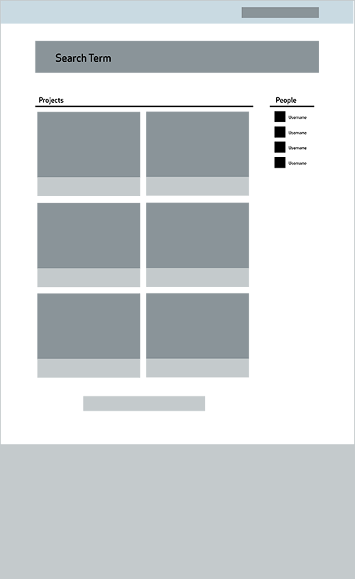
For the search results redesign, I depended on customer support emails, search logs, and some insights I had during a usability study I conducted before I started my internship.
At the time, DIY's search results were optimized for browsing projects based on keywords like Minecraft or Harry Potter, but didn't serve members who were looking to find their friends on the site. Due to our memberships' ages, the "find friends" experience is a bit different than it would be for most sites you and I use.
For one thing, many of DIY's members don't have accounts with other social networks. They don't have an established online presence with a social graph to pull from, so importing isn't an option. They also aren't using their real names, so they can't just search for a friend on their own and add them.
I based my decision to show fewer member results in some designs based on this aspect of our members' behavior. Because members make unique names with DIY's own set of avatars, wide net searches don't make sense. On Facebook I could try to find my friend Alex, by searching his first name and another criteria like city to narrow things a bit and then combing the results. On DIY that's just not practical. It's, rightfully, I think, up to DIY's members to choose who to share their profile with. The searcher either gets the username right or they don't. I wanted to leave some room for multiple results because some pieces of names are popular and kids might forget numbers or spaces between sharing names IRL and actually doing the search.
The most representative thing of a member on DIY is his or her projects, so I wanted to emphasize those in the results. There's also a quirk in the way search works where we look for strings in the comments on projects. This is to help with results for themes or types of projects, but it also means that if you search for a username, you'll see projects that member has commented on as well. I could have introduced a flag prior to the search to eliminate that, but I thought the extra step was unnecessary friction for the user and it's also a kind of fun method for discovery. I decided DIY is a community that embraces quirkiness and I didn't want to be the one to trample it.
I also decided not to go with a toggle for projects and results after the search was completed because when a user searches for someone correctly, there would just be one result.
Profiles
This is one of the few screens I could track down of an exercise I did with Hartley Miller while she was designing a new profile experience to roll out with DIY's Extra Awesome release. I switched to working on the To-Do feature before I made much progress. All the awesome work you see on the new DIY profiles is all Hartley :D.
DIY
After running a usability study around some of DIY's core actions and social features for my Masters program, I spent the summer interning in their San Francisco office.
While there, I worked on the service's moderation tools, designed a new to-do feature, and took a new search experience through wireframes before I had to return to Seattle.
DIY was an incredible, eye-opening experience for me. I grew a lot as a designer and got some great insights into my strengths and weaknesses.
See how my project at Vox is going
Before DIY, I was at Opal